After eagerly waiting for and being disappointed by at least two large Google projects in recent years – Google Wave and Google+ – I was apprehensive about trying Inbox by Google.
In fact, it was one of the few things I didn’t sign up for as soon as I could. But it’s Google and I couldn’t resist giving it a go, like every early adopter.
Signing up for Inbox by Gmail is as simple as going to inbox.google.com and sending an email to request an invitation. The time it will take to receive your invite is uncertain and depends on Google’s timing.
There have been two fairly large rounds of invitations for Inbox sent out and a third is expected soon. In the meantime, Google has started providing some Inbox users with a few invites to send to friends, but apparently not all new users have that privilege yet.
So, while you wait for your invite, here is my first take on Inbox.
I love it. And like everything else I love, it’s not perfect but it offers solutions. Solutions that I’ve needed for a long while now.
Bundling Similar Emails like Social, Updates, Promotions
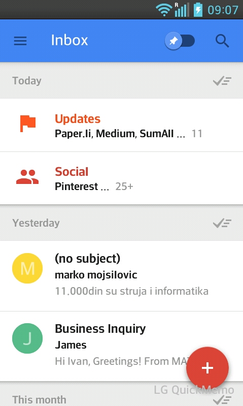
The first of those and my personal favorite is a little thing called bundling. Right now it bundles very basic categories like finance, travel arrangements, and social media notifications and such.
Sure, I can turn off the notifications for Facebook and Twitter, but if those were the only social networks I had accounts on, I wouldn’t be much of an early adopter, now would I?
Even with Facebook and Twitter email pings off, there are dozens of social media notifications neatly bundled into one line in my Inbox.
Pinning Important emails – ex Staring
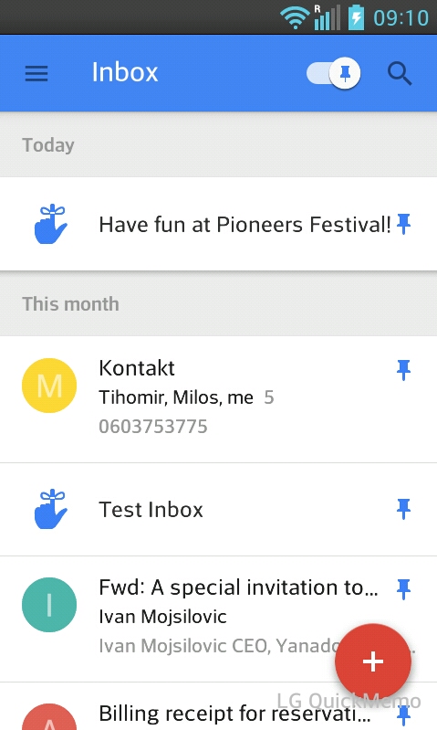
I’m assuming pinning is supposed to be a feature that users can mark important emails with, to get to them easily in via a blue pin icon positioned instinctively in the top right-hand corner.
Because my emails are now already neatly bundled and the important stuff separated from the stuff that can wait, it took me just a day or two of playing with Inbox to start using the pin feature to bookmark stuff that isn’t so important but that I do want to read later.
News, updates from my industry, and newsletters particularly get pinned often in my Inbox.
Snooze emails for later – Boomerang main feature
Yes, I’m the type that needs a snooze button on everything. Not because I procrastinate but because I’m usually doing at least three things at once.
When a fourth or fifth flies in, I need that precious snooze time to get to it. Now there are several Gmail apps that do that better than Google itself (Boomerang for Gmail) and that I won’t stop using anytime soon, but Google finally seems to be going in the right direction (again) with email functionality.
Reminders For Simple Tasks
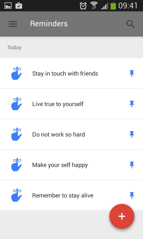
I hope you’re able to keep up with all of the features I’m listing here. And speaking of keeping up with things, Inbox also includes one of Google Now’s simple yet useful features – reminders.
This feature doesn’t seem to have been perfected yet and I’m assuming Google will connect it to Google Calendar in the future, but right now it’s basically like adding sticky notes to your Inbox, just so you don’t have to glue Post-It notes to your screen or desk anymore.
Your Old Folders Are Now Your Own Bundles
All those folders and filters you’ve spent years creating and organizing in your classic Gmail are still there. All still neatly packed up in the menu and your Inbox. So you get to keep your folders and your bundles too.
Done – Marking Emails as Done is The Sexiest Feature So Far
This is such a simple and necessary feature that I really can’t understand why Google hasn’t added it to Gmail before. Since emails are like task, by marking those as done (read, executed, whatever) make sense in cleaning your inbox.
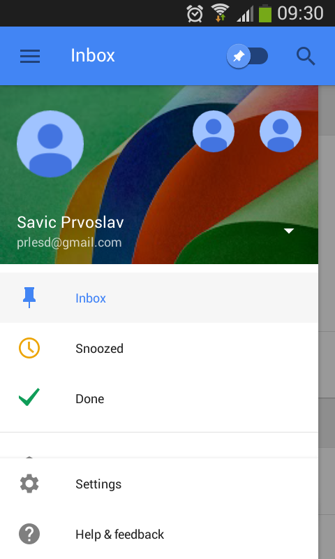
All “done” tasks are not gone for good. You can find them all in the “Done” menu option in the left sidebar and always get to through the left sidebar menu.
Speaking of the left sidebar menu, it leaves something to be desired in the web version. It’s available right there on the top left side, but as soon as I click on anything else on the page, the menu closes, unlike in classic Gmail.
Inbox by Gmail has obviously been created for use on smartphones and tablets, in which case the left sidebar being constantly open would block half your screen.
Conclusion – To Switch or Not to Switch?
In order for me to switch over entirely from classic Gmail to Inbox, I would need the option of keeping the menu in the left sidebar open at all times.
That one (pretty major, in my case) flaw aside, Inbox by Gmail is a Google product I can finally really be excited about. We’re all looking forward to seeing how far it goes.

